visualizing evolution, done!
Or at least done for now. At the SHARP conference in D.C. last week, I presented on a panel I created with two wonderful colleagues, Loretta Gaffney and Debra Mitts Smith (don't miss her book Picturing the Wolf in Children's' Literature from Routledge), about the "struggle for survival" of controversial books in children's literature. Loretta talked about sex, Debra talked about predators, and I presented on "The Art of Evolution: Images of Geological Time in Science Books for Children, 1921-1956. I'll most likely upload the powerpoint to my website soon.
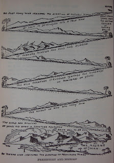
The 1921 date is important because that's when the first Newbery medal was awarded to a rather hulking book (not as long as some of Rowling's, but still) called The Story of Mankind by Hendrick Van Loon. Here's how he visualized human evolution:
The text reads:
“The ascent of man. The world was millions of years old when a creature appeared which was to be our ancestor. The ascent of man was very slow. This wild creature struggled upwards for hundred of thousands of years. It survived hunger and cold and disease. At last it developed into a true man. The zigzag line indicates the duration of prehistoric times. The short heavy line indicates the duration of historic times.”
So that's one example, but not the prettiest one. My personal favorite is by Alex Novikoff (from Climbing Our Family Tree 1945), whose academic career and anti-eugenics stances are traced in the biography Stalking the Academic Communist by Holmes. Excerpts of his work also appear in Mickenberg and Nel's Tales for Little Rebels (a good follow-up to Julia Mickenberg's Learning from the Left which won multiple prizes).
But the most stunning one in terms of color is definitely Bertha Morris Parker's illustration from Golden Treasury of Natural History from 1952.
Here you see time on a left-to-right axis and the swaths of color represent predominant kinds of creatures during those times, such that the top right orange area represents "mammals."
My main analytic framework came from a new book (2010) called Cartographies of Time by Daniel Rosenberg and Anthony Grafton, who argue for timelines as more than just the facts of chronology. Their timeline of timelines attempts to understand their historical development over the last 250 years, arguing specifically that “…traditional chronographic forms performed both rote historical work and heavy conceptual lifting.” (p. 11) I argued that these ways of visualizing evolution did the "heavy lifting" of both showing ways of visualizing geological time that were accessible to child readers and of indicating cultural beliefs about how humans are different from animals, an especially touchy topic when it comes to evolution. In the Novikoff, above, a zoom-in might show you that the man at the top right ("top" being a visual metaphor that signals "higher development" in many of these illustrations) is holding a gardening hoe, evincing the long-held belief that humans differed from animals in their tool use (which is now known to be not as extreme a difference as previously thought).
I got a great deal of useful background and range of scholarly approaches from the book Victorian Science in Context by Bernard Lightman (an organizer of the SHARP conference which I just attended and a really nice person), which now goes back to the library. As do a suitcase full of great primary source texts. I say goodbye to them to make space for class prep, writing the other promised article on evolution (with Caroline Nappo, in which we examined 244 books for their evolution content over the course of a year), and focusing on the upcoming article for Children and Libraries about the historical roots of evaluation in youth services librarianship.


